
Version 1 of the site is officially live, and this week was all about turning a rough layout into something that actually works for real people. Not just on a big desktop monitor, but on the device most visitors will use first: their phone. Accessibility and usability aren’t optional anymore, they’re the baseline so this build log is all about the changes I made to get there.
Making the site work everywhere
When I first pushed the layout live, it looked great on desktop… and then I opened it on my phone.
Instant reality check.
The hero image didn’t scale properly, the pillar icons were unreadable, and the spacing collapsed in ways that made the whole thing feel messy. So I stripped it back and rebuilt the homepage with a mobile‑first mindset:
- Removed the hero image entirely
- Reworked the spacing so the intro actually breathes
- Simplified the layout so it flows cleanly on small screens
- Standardised the featured article cards so they’re consistent and readable
The result is a homepage that feels the same on every device. Clean, intentional, and easy to navigate.
Putting the Themes (Pillars) in place
A big part of this update was getting the Themes structure ready for future content. Each theme now has:
- its own dedicated page
- a clear intro
- a consistent layout
- and soon, its own icon at the top for identity and visual flow
I’ve set everything up so that when I publish a new article and select a category, the site automatically fills the right theme page. No manual sorting, no wasted time just write, publish, and let the structure handle itself.
This is the foundation that will let me scale the site without drowning in admin.
Version 1: A solid base to build on
This is still Version 1 of the website. I’m happy with it, it’s clean, functional, and reflects the direction I want the project to go but it’s not the final form. I’ll keep studying web design so I can improve:
- first impressions
- accessibility
- layout consistency
- and overall visual polish
Version 2 will be a proper theme redesign, built once I’ve learned more and have a clearer vision of where the site is heading.
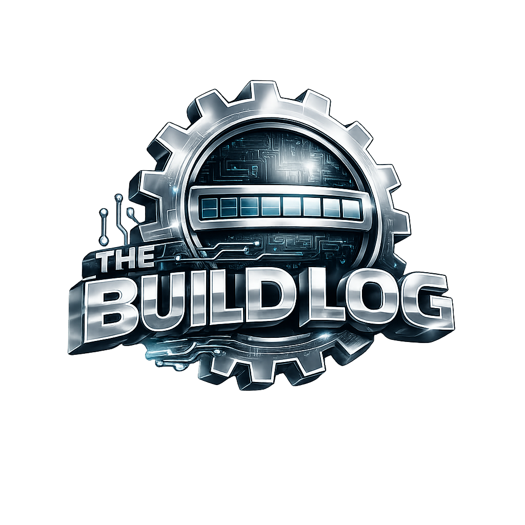
Generated graphics and the logo
One of the most fun parts of this build was generating the graphics. They were fast, cost‑effective, and surprisingly good. The logo especially influenced by networking diagrams and cyber threat maps and linked visually to my personal blog ties everything together. It gives both sites a shared identity without feeling forced.
It’s simple, clean, and it works.
Now the real work begins
This site isn’t the project, the writing is.
Version 1 gives me a stable, structured base so I can focus on what matters most:
- creating content
- building out each theme
- and sharing practical, real‑world cyber security guidance
The design will evolve, the structure will grow, and the visuals will improve, but for now, the foundation is set. Time to get writing.